Let’s start by looking at the icons pinned to the macOS Dock:
![]()
The third icon—YouTube Music (the PWA)—looks off. The issue isn’t that it’s circular while the others are square; it’s that the icon is much larger. When I compared the icon files for VS Code and YouTube Music, the difference became obvious:


If that still feels subtle, this comparison makes it clear:
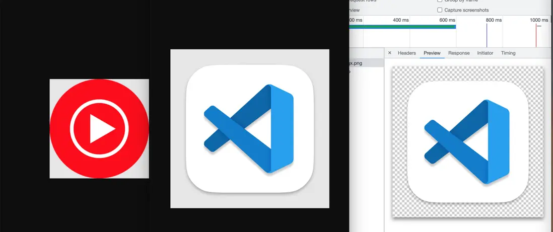
Screenshot 3 is the asset shown in the browser’s developer tools (F12). The faint white border around screenshot 2 is actually part of the image and fully transparent.
Screenshot 1 also has a white rim at the corners, which is likewise transparent.
So although the raw image sizes are the same, macOS renders them differently because VS Code’s icon includes a transparent border while YouTube Music’s does not.
When you build a PWA you typically add icons via manifest.icons, for example:
{
  "icons": [
    {
      "src": "logo64.png",
      "sizes": "64x64 48x48 32x32 24x24 16x16",
      "type": "image/x-icon"
    },
    {
      "src": "logo192.png",
      "type": "image/png",
      "sizes": "192x192"
    },
    {
      "src": "logo512.png",
      "type": "image/png",
      "sizes": "512x512"
    }
  ]
}
In my project all three icon files had VS Code–style transparent padding. However, on Windows the taskbar icon ended up tiny—the rightmost icon below:
![]()
Next to the Brave browser icon it’s noticeably smaller. I suspected Windows also used manifest.icons, so I removed the transparent padding from logo64.png, logo192.png, and logo512.png. It didn’t help.
It turns out Windows (tested on Windows 7) pulls PWA icons for the taskbar and desktop from favicon.ico, while macOS relies on manifest.icons. That mismatch was the root cause.
The workaround is to keep transparent padding in manifest.icons (for macOS) while serving a padding-free favicon.ico (for Windows).
Update: On Windows 11, Chrome and Edge do read manifest.icons. That creates an awkward trade-off: if you omit the border, the icon looks perfect on Windows 11 but appears oversized on macOS. If you include the border so macOS looks right, Windows 11 renders it smaller than adjacent icons.
You also need to treat iPad separately:
- Safari ignores the PWA manifest and looks for
<link rel="apple-touch-icon" href="/apple-pwa.png">in the HTML. - Icons must not include transparent pixels—Safari fills them with solid black. (The outer ring on the VS Code icon above is transparent.)
- Keep the artwork flush with the edges; Safari adds its own outer mask. (In other words, skip custom box shadows.)
- To make Safari’s title bar transparent, set both
apple-mobile-web-app-capableandapple-mobile-web-app-status-bar-style.And watch out for the safe area (the notch) in portrait and landscape. With the settings above, Safari obeys the
theme-coloryou specify.